The Brief
Design a mobile platform where teenager users learn about the stock market and are made to understand the basics of trading, practically.
This platform is supposed to work like Duolingo, but instead of learning a new language, they learn about the Stock Market. Once they reach a certain level in the product, they are allowed to invest real money and trade stocks based on their learning on the platform.
Research
Identifying the Problems
1. Most users don’t know the ABCs of the stock market
2. How do we ensure that the user does not get bored?
3. How do users get real-life experience with the stock market without any consequences?
Wireframing
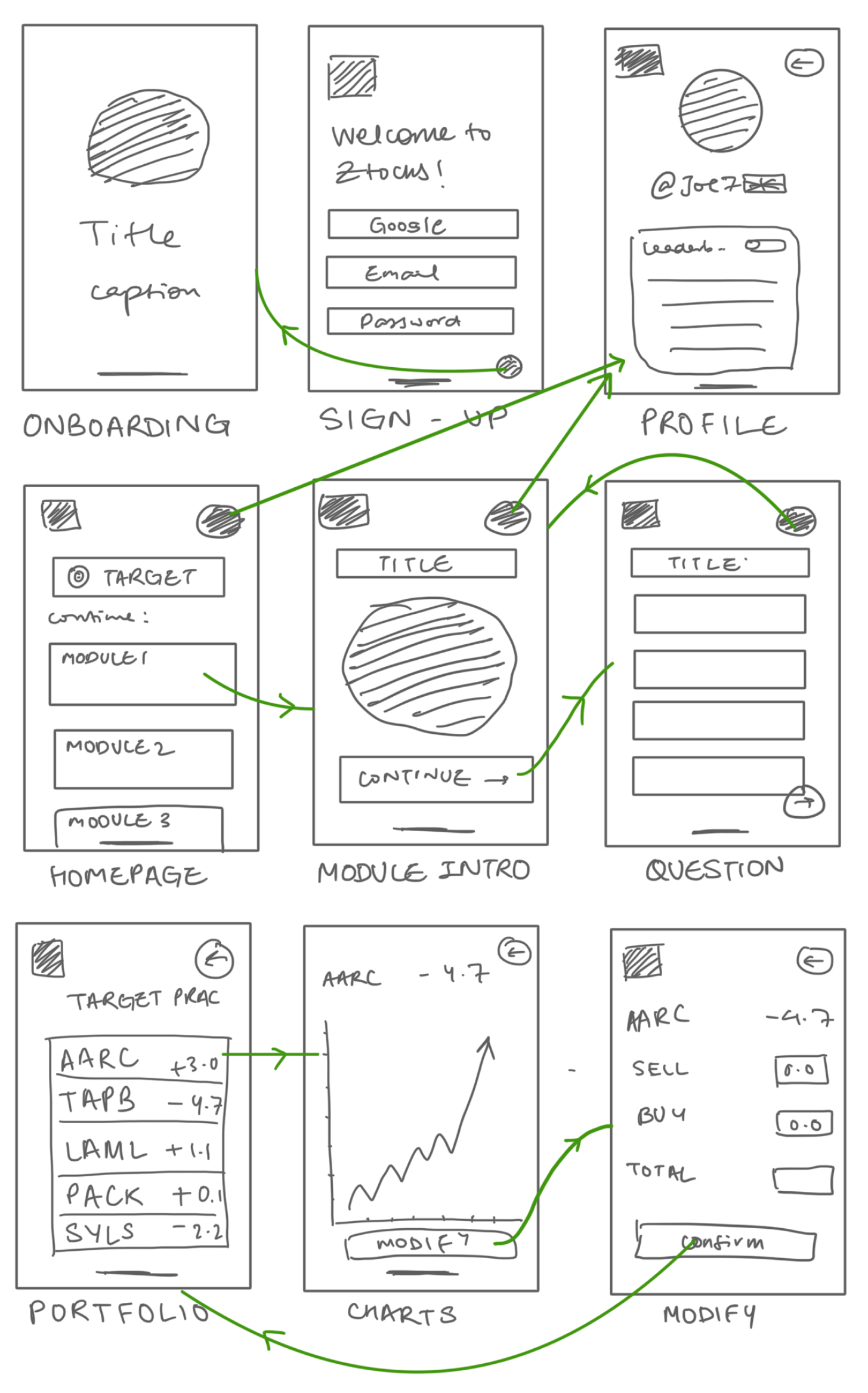
The basic screens would include onboarding, homepages, target practice, and a user profile.
An extension of these would include intros and questions for the modules, portfolio, charts and a modification page for target practice and a sign up/login page for the user.
User Journey Map
I kept it simple, with few options and an easy interface so the priority is to learn about finance, not the interface itself.
User Persona
I created a persona for the user, keeping in mind the age group and the target audience.
Development
Visual Design
Colour Scheme

Colourful, dynamic and fun to remind the user that it is, after all, a game application and not a study one.
Illustrations

Illustrations are fun and relevant. Attributed to Matilda pack by getillustrations.com
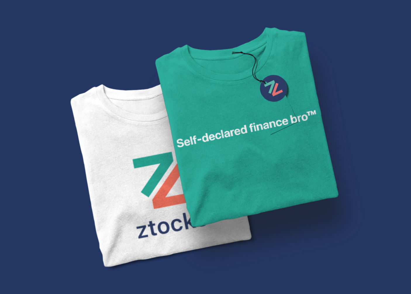
Logo
Two half arrows (representing the ups and downs of the market) combined to form a Z, for GenZ.
Font

I designed this app for an iOS system , so it employs SF Pro Display for titles and SF Pro text for content.
Interface Iterations
Version 1, 2021
This version employed more focus on the playability of the prototype rather than usability. The colours do not offer much contrast and the interface looks ancient in hindsight. Images are not dynamic, but the screens were extensively designed for every possible iteration of user choices. It provided invaluable information and ideas for the second version. After all, we are nothing if we cannot learn from our mistakes.
The Figma file can be found here.
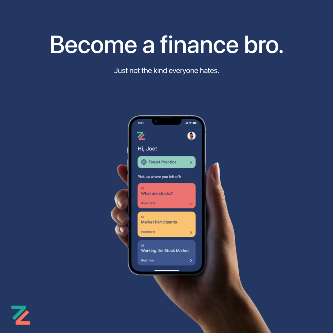
Final Product
In this version, I used a clean but colourful interfaces that better highlighted the gamification within the app. Bright colours make it fun for the younger generation and the high contrast is better at capturing and keeping the user’s attention.
Onboarding ensures no time is spent trying to figure out the use cases of the app.

Sign up with several options to allow ease of access for the app.
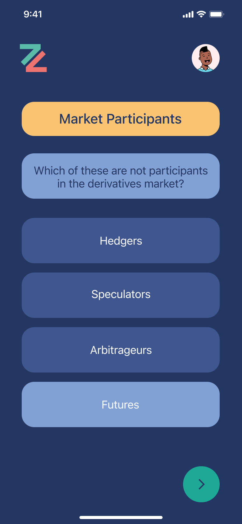
Enough “whitespace” so nothing is accidentally clicked in the modules. Ensures satisfaction from the reward system.
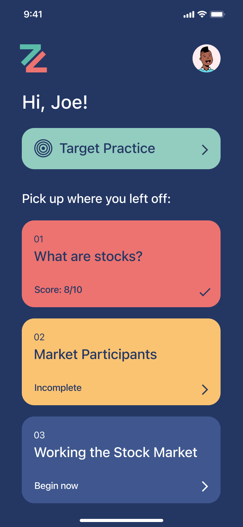
Different colours for completed, incomplete and unattempted modules for clarity of the user.
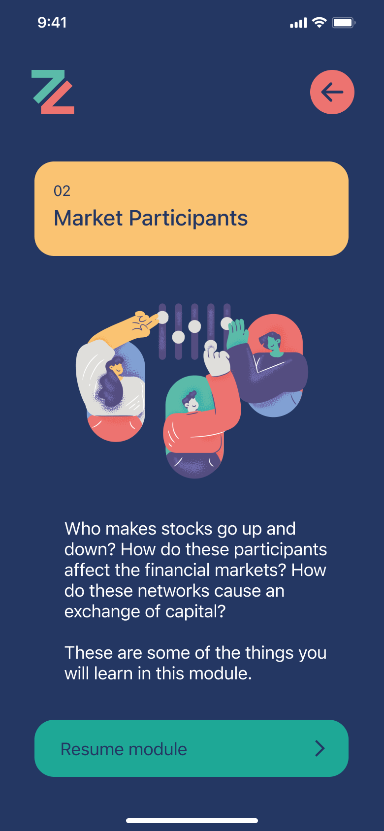
Intros to modules provide an overview of exactly what they’ll be getting into before they begin.
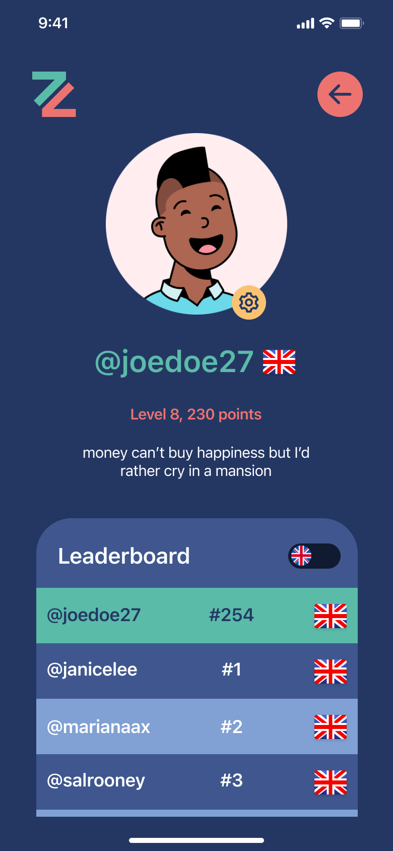
Leaderboards, bios and and country flags promote social learning.
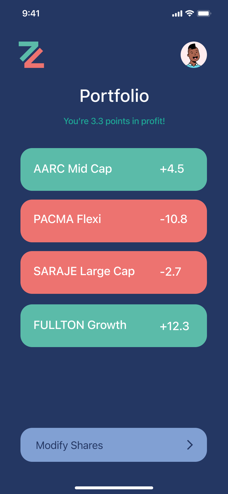
View your portfolio in target practice and see how many points the user earned/lost

View graphs at higher levels so the user may do a more extensive analysis
Branding